Managing tasks shouldn’t feel like a task itself — and that’s exactly the problem I wanted to solve with my latest dashboard design project.
Over the past few weeks, I worked on redesigning a complete task-management ecosystem for a productivity SaaS concept called Brusque. The goal was simple:
Make productivity feel effortless, intuitive, and visually calm — even when the workload isn’t.
Below is a quick breakdown of the design, the pain points we tackled, and how the new UI helps users stay on top of their projects with confidence.
🎯 The Problem Users Were Facing
Through user analysis, I identified a few common issues:
Cluttered dashboards that overwhelm instead of guiding
No clear hierarchy, making it hard to understand what needs attention now
Missing insights about workload distribution and productivity patterns
Poor visibility into deadlines, overdue tasks, and upcoming priorities
Task lists without context, leading to confusion and delays
Team activity being hidden, reducing collaboration
The challenge was to bring clarity, structure, and visual intelligence to the user experience — without sacrificing simplicity.
✨ The Solution: A Modern, Insight-Driven Dashboard
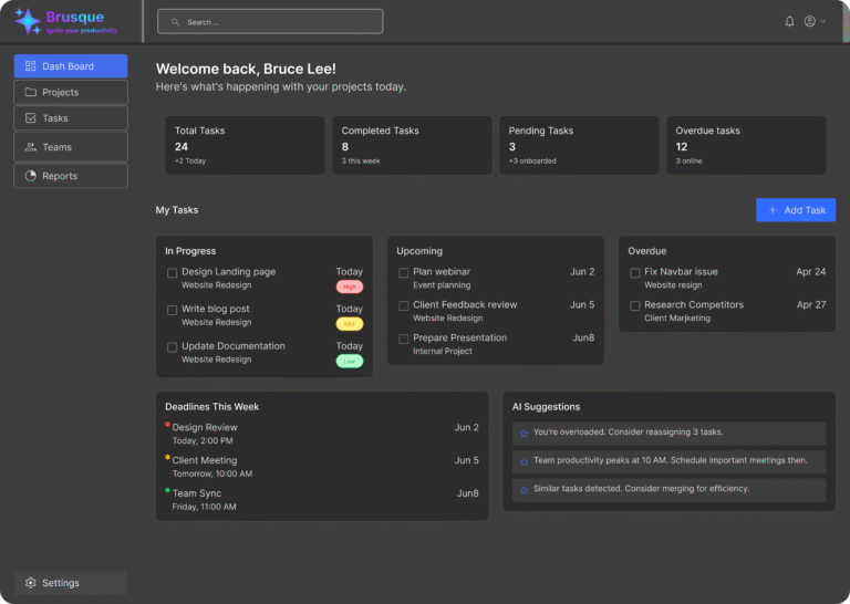
🔹 1. A Warm, Personalized Welcome Screen
The first dashboard screen greets users with a friendly message like:
“Welcome back, Bruce Lee! Here’s what’s happening with your projects today.”
This instantly creates a more human connection and motivates users to jump back into work.
🔹 2. Quick Stats at a Glance
I designed overview boxes showing:
Total tasks
Completed tasks
Pending tasks
Overdue tasks
Each block is clean, bold, and easy to scan — helping users understand their workload in seconds.
🔹 3. Smart Task Organization (Today, In Progress, Upcoming, Overdue)
Instead of one long, chaotic list, tasks are visually grouped by urgency and status.
Users can now immediately spot what to work on first.
🔹 4. Deadline Timeline + Priority Indicators
Color-coded status labels (High, Medium, Low) and a clean schedule area help the user:
Avoid missing deadlines
Identify what needs immediate attention
Manage time more effectively
🔹 5. AI-Powered Suggestions Section
I created a dedicated area for intelligent tips like:
“You’re overloaded. Reassign 3 tasks.”
“Team productivity peaks at 10 AM.”
“Similar tasks detected. Merge for efficiency.”
This transforms the dashboard into not just a tool, but a smart assistant.
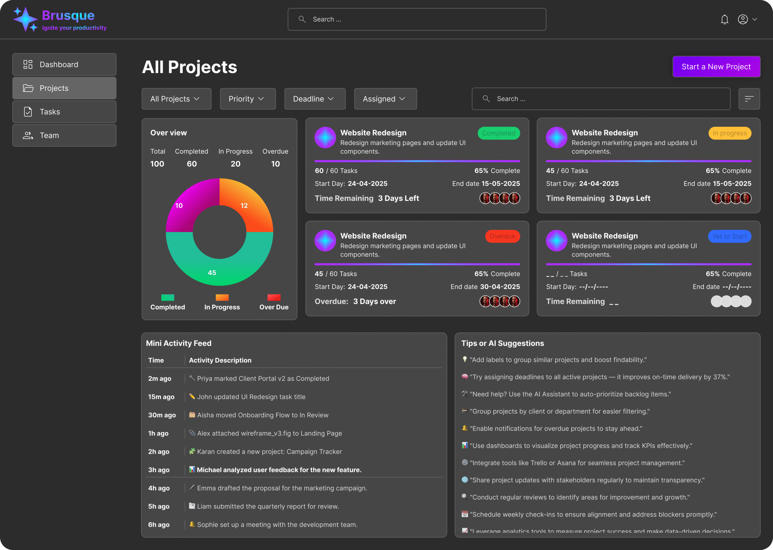
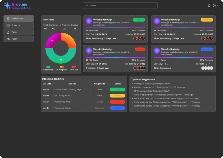
🔹 6. Detailed Projects View with Progress Bars
Another screen showcases project cards with:
Progress percentages
Start & end dates
Overdue alerts
Team member avatars
Time remaining badges
This allows users to judge project health instantly and act before something slips.
🔹 7. Mini Activity Feed
A real-time activity feed ensures full transparency across team actions — whether someone completes a task, updates a project, or adds new items.
💡 Why This Design Works Better
✔ Users feel less overwhelmed
✔ Tasks are easier to track and prioritize
✔ Deadlines are impossible to miss
✔ AI helps reduce mental workload
✔ Teams collaborate more effectively
✔ UI feels clean, modern, and balanced
Every component is placed with a purpose — reducing friction and giving users clear control over their day.
🧩 Final Thoughts
This dashboard project was more than just a UI exercise — it was about solving real productivity challenges that teams face every day.
By creating a layout that’s visually calm, data-driven, and human-centered, I ensured users get a workspace that adapts to their workflow instead of the other way around.
If you’d like a similar dashboard, product UI, or complete brand system designed for your startup or SaaS product, feel free to reach out — I’d love to build something powerful for you!